


We connected for a quick Q&A with designer Mateusz Dembek to explore the process of designing Colors 2.0 and Settings 2.1.

Q: What was the original design of the Shift interface?
A: When we first launched Shift in 2017, it looked very different than it does today. Back then, Shift was a simple solution for managing all of our Mail, Calendar, and Drive applications. As Gmail users ourselves, we designed Shift to compliment the Gmail interface, opting for a sleek monochrome look (see below for the initial designs). The accent colors red, blue, green, and yellow were used to add a lively undertone to our brand. But, we had big goals in our sights. With this in mind, we set out to create a beautiful product with a design flexible enough to complement almost any app or background integrated with it.

Q: How have Shift’s features and design evolved over time?
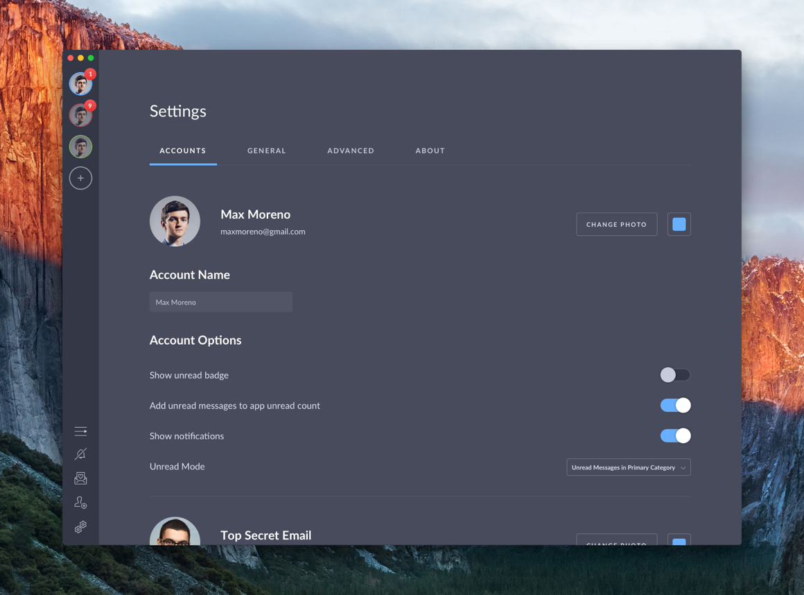
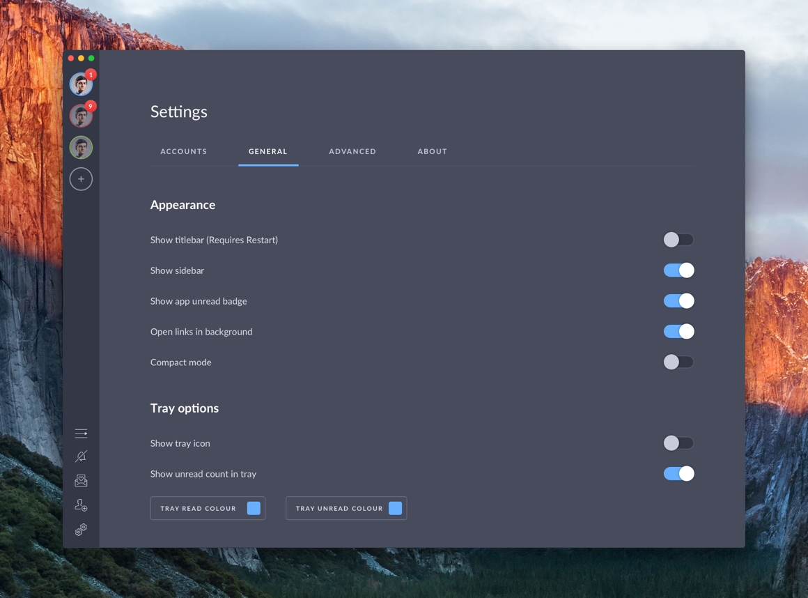
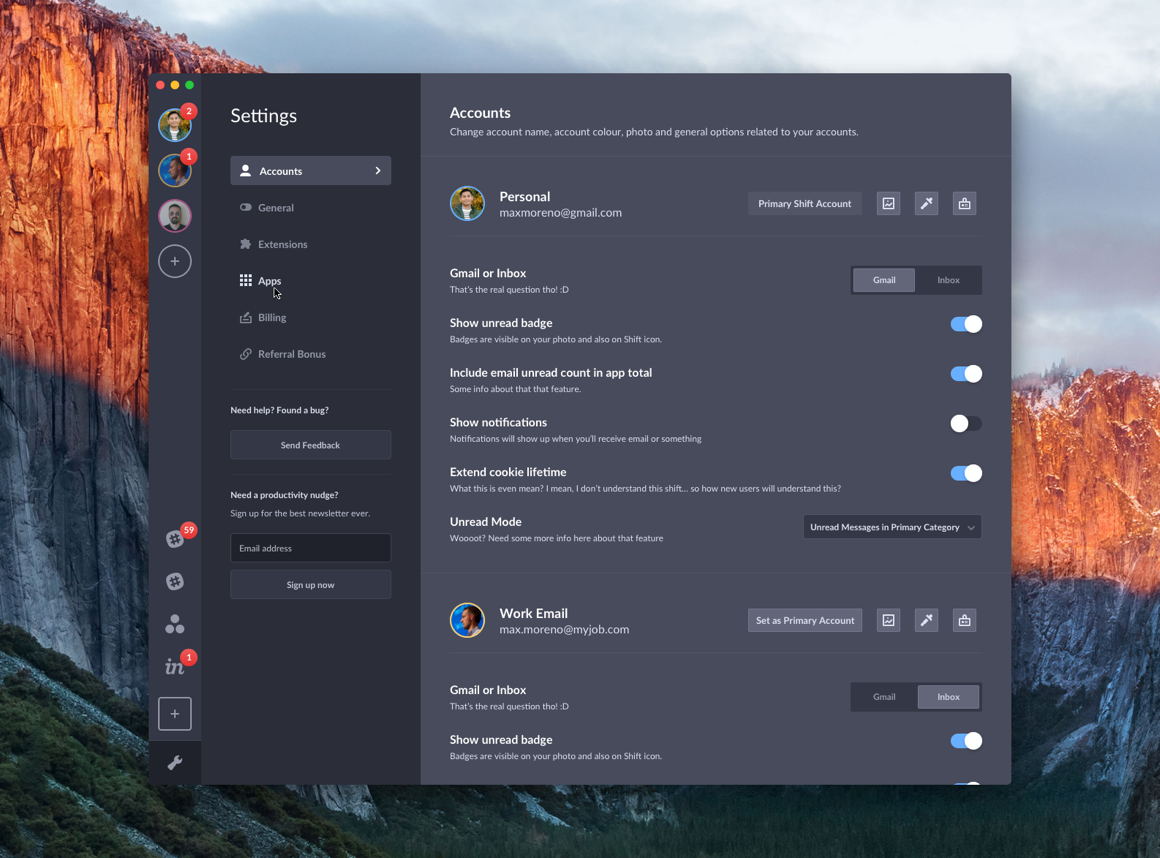
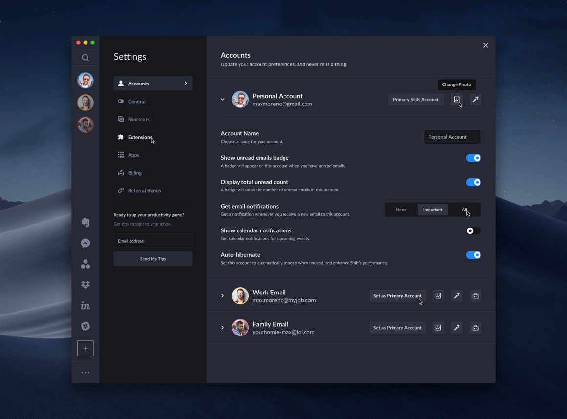
A: As you can see in the images above, our Settings options are drastically different than today with only four tabs. After four years, countless product releases, and thousands of feature requests from our growing community, Shift evolved into the all-in-one workstation thousands rely on to get their most important and focused work done. And, we couldn’t be more thrilled. We listened closely to our customer’s feedback and added apps like Slack, Asana, Trello to the mix as well as creating our own custom features including Focused Web Tabs, Unified Search, and Workspaces. In turn, our Settings section expanded. Despite all these changes, the overall design of the Settings interface itself had not been updated in years. So, we decided to give it a refresh. As you’ll see below, the new Settings interface features Light and Dark Theme customizations, a range of expanded options, and more intuitive navigation.
Q: How will the changes improve the user experience?
A: As Shift continues to evolve and change, it was important that we choose a layout that would support various updates as we release new features. We approached this project like we do any other in Shift—with our community in mind. We wanted to ensure that the new Settings updates would improve the way our customers explore Shift and discover new features. Descriptions were added underneath each option to provide more information about what each setting does. We also updated the Settings layout to give it a more streamlined look. Finally, we added graphic improvements to enhance its overall appearance and give it a refreshed look.
Q: What inspired the changes to the Dark and Light Themes?
A: Shortly after completing the graphic work for the new Settings interface, Apple released the Dark Theme for its latest macOS. To keep up with the times, we also choose to update our look. Not only did we update the color of Dark Theme itself, but we also changed every color you see in Shift—whether it's an icon, text or in the sidebar.
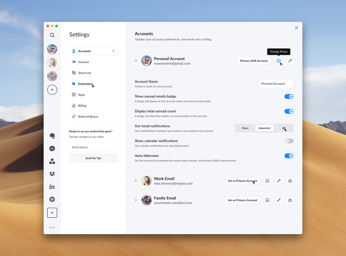
Although not a drastic change, the updated colors give the interface a refreshed, polished look which our community loved. In particular, the changes were met with cheers and applause from our Beta community. Of course, the new Settings interface also received a refresh with a complete redesign in terms of colors.
Lastly, we created a light version of the new Settings interface to match our Light Theme. Try it for yourself by going to Settings > General > Appearance and choose “Light” beside the “Theme” setting.
Let us know what you think of the Settings redesign
We hope you enjoyed learning more about the new Shift Settings and the magic behind the design process. We have many more exciting updates rolling out shortly. So, make sure to follow us on Twitter, Instagram, and Facebook to be the first to know when the latest features drop. And, give us a shout on social media to let us know what you think!
If you aren’t a Shift user yet, you can download it here.


 Share on Facebook
 Share on Twitter


